Today we’ve introduced 4 new fonts to the Virgin Wood Type catalog. A veritable cornucopia of extra virgin faces and designs we've offered in the past.
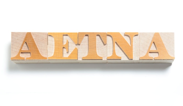
Aetna is the first font offered by VWT to be redrawn and cut entirely in-house. The Well’s cut specimen found in Rob Roy Kelly’s American Wood Type served as the direct inspiration for this Fat Face Roman. I had the opportunity to draw it and we all contributed to cutting the first alphabet. We are extremely happy to see Aetna in wood once again. This is an all-cap font and a perfect display face to get at some serious wood typing.
Preissig Scrape. This Extra-Virgin face was the result of a collaboration with Rich Kegler of P22 Type Foundry in Buffalo, NY. Preissig Scrape is of particular interest to us here at VWT. It was designed in linoleum in 1914 by Ceczh Modernist Vojtech Preissig and digitized by P22 in 1997. Bill then had the privilege of cutting it in wood in 2011 and we wanted to get it back here on the site for you.
Gothic 737 is an American Wood Type (AWT) Original; it’s one of the three weights in the 700 series of lineal gothic patterns acquired from AWT. Definitely the middle child of the set, you can make it yell about a wedding or read a story to a five year old. We have plans to release the other two (735 and 739) with time. You may also remember outline versions which facilitate a chromatic-effect when registered against this. We’re working on getting them up soon. If you’re interested before you see it, please drop us a line.
Aldine Expanded, lowercase. David Wolske’s Aldine Expanded is now complete! He finished up the lowercase version of this popular slab serif over the summer. We’ve also packaged the new cap and lc ligatures and diphthongs as extra sets. We’re happy to help bring such a wonderful revival to your shop.
On another note, Virgin Wood Type is growing. We’ve added two team members this summer to keep up with your fiendish wood type needs. Welcome Katie Carey and Matt Rieck!
Katie moved to the city from the depths of woodland-living to serve as a resident potter at the Genesee Center for the Arts. After I roped her into prepping files and setting specimens for our launch back in June, Katie continued working with us after completing the required seven-year type cutting apprenticeship in just shy of two weeks.
Matt has a degree in English, so naturally he was drawn to VWT. Thinking that he would spend his work days pouring over manuscripts in search of splendid initial cap letters, imagine his surprise when we showed him his seat at the pantograph. Not one to disappoint, Matt has taken to cutting type like a monk takes ink to a scroll. For many years, Matt was a slave to the corporate masters until he was laid off one too many times. In addition to VWT, Matt is an independent technology tutor, an online purveyor of “stuff,” and a longtime lover of the book arts and letterpress.
As always, message us directly with questions, thoughts or custom ideas. We’re off to the Wayzgoose in Two Rivers this weekend where we will assemble with our wood type family to talk about important things like setting the entire codebase of healthcare.gov in 12 line American Chromatic.