I’ve spent the majority of my life earnestly pursuing an opportunity to be in outer space.
The plan was to pilot Naval aircraft and work my way into the NASA scene. I induced (gracefully) a separation from this plan after one year as a Midshipman in the NROTC program at the UR, but spaceflight continues to occupy my brain. Lately these thoughts have been colliding with those that occur when designing visual communications.
Consider the following: If you read this sentence quickly, out loud, it will take you two seconds. In the same amount of time, at 1100 mph - a safe estimation for a Navy pilot - you would have traveled 3200 feet; over half a mile. Astronauts in orbit are falling at 18000 mph. At these speeds conventional speech isn’t fast enough to facilitate effective communication via radio to other pilots and ground crews.
Thinking about this feels a lot like a question I ask while editing copy or laying out a poster: How few words can I use to express this idea? While pilots are focused primarily on optimizing communication within a time constraint, designers are optimizing inside the spatial constraints of publishing.
For the pilots, Brevity Code was created to solve this problem. Used by all branches of the US Military, it standardizes speech procedures to increase information density while decreasing quantity of words. It optimizes some sort of (what I’ll call) data flux; a rate of idea flow per unit radio bandwidth.*
Visual communication design affords degrees of freedom (channels) such as color, type, size, layout, context, etc. to convey emotion. I’m inclined to postulate that Brevity Code works to strip emotion from the communication for the sake of clarity, however, unambiguous visual communication relies on emotion to be successful. Clarity does not exclude emotion, so these particular channels must be of lower priority at 1100 mph.
But what about seeing a billboard while piloting a car at 65 mph or glancing at a poster while walking around at 4 mph? These cases suggest that visual communicators are exposed to time constraints like pilots. To us, however, emotion is a bonus. It’s a toy we get to play with. We desire to have an effect while they aim to ignore it, valuing raw content over form. Not only are we delivering content within a time constraint, but all the emotion as well. This transmission requires more bandwidth, time, or both...
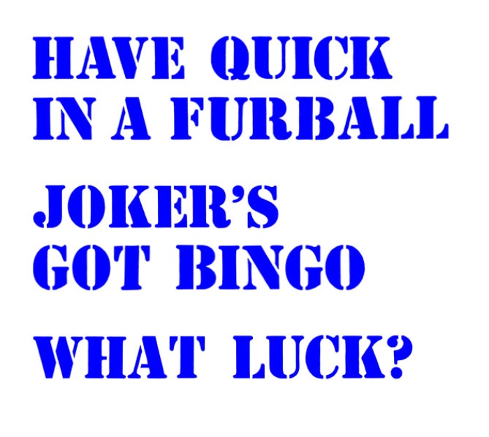
Ok, to the type specimen! I’ve always associated Stencil with the military. I don’t suspect this is an uncommon association (in spite of the myriad usages one might encounter elsewhere) so what better a font to communicate about military communication!? Below is a brief explanation of the Brevity Code that I’ve chosen to attach to Stencil:
HAVE QUICK IN A FURBALL Have Quick is a system used to protect radio communications. It employs some crafty frequency-switching techniques to prevent folks from jamming the AM radios that have been used for short-range air-to-air and ground-to-air communications since the end of WWII:
Aircraft and ground radios that employ HAVE QUICK must be initialized with accurate Time Of Day (TOD) (usually from a GPS receiver), a Word Of the Day (WOD) which serves as a key, and a NET number (providing mode selection and multiple networks to use the same word of the day). The word of the day, time of day and net number are input to a cryptographic pseudorandom number generator that controls the frequency changes.
A furball is much of what you might expect: a big pile of tumbling, fighting aircraft in the sky with a healthy mixture of good guys and bad guys to make it more fun when someone decides to start shooting.
JOKER’S GOT BINGO is a mashup of two declarations of fuel level. Bingo is the amount of fuel needed to get back to base. “Bingo to Mom” is a call a pilot uses to indicate they are en route to base/ship (mother) and they have enough fuel to get there. Joker is the fuel state above bingo where you should start to leave whatever it is you’re doing. It's much like the quarter tank rule my Dad tried - in vain - to ingrain into my habits.
WHAT LUCK? is a check-in - a request for mission status. One might say it’s a friendly “Hey did that enemy plane crash into the ocean or what?” You can definitely get away with asking ‘what’s up?’ so Brevity Code doesn’t get many condensation points for this. I just like the way it sounds.
So what about a Brevity Code for designers? I haven’t seen much beyond the “infographics” talking about what button color I should use to make you buy our wood type, what font to pick if it’s summer (OMG these!), or preferred layout proportions for a 16th century manuscript. Maybe that’s a little harsh. I know there are some healthy rules floating around but there certainly does not exist a set of design standards that match this degree of rigor.
Is our (or our viewer’s) time less valuable than a pilot’s? Does it cost designers less than the military to neglect this degree of optimization? Are there, actually, that many more variables in visualizing ideas and conveying emotion than in flying jets? I’m skeptical. I’m also longing hard to use a secret design code in critiques, so let's get on it.
Finally, if you’re into listening to some live Brevity Code in action (or terrible Bad Company covers) this is the video for you.
*I spoke with some folks and learned that this is actually called information entropy, a topic of research for information theorists. At a cursory glance I find the problem of influence the most fascinating element. In order to successfully communicate, the listener must not only receive and understand your message, but react and respond in an appropriate way. Additionally, it begs an ethical question prompted recently by Michael Rock: when does inspiration become manipulation?