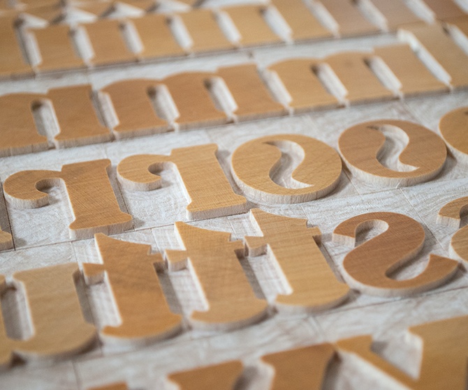
The story of how we came to offer Inland is long and circuitous, but the final result is spectacular if we do say so ourselves. I fell in love with Inland's bulbous serifs and curvaceous bowls while leafing through The Art of Wood Type by Gregory Ruffa. According to the book, this face was originally cast in metal and offered by the Inland Type Foundry of St. Louis.
Working with Terry Wudenbachs, I drew the letters and cleaned up the inconsistencies, e.g., made standard the serifs. The smallest bit we use on the pantograph can only cut away so much, so almost every character has to be hand-trimmed to achieve this font's characteristic points.
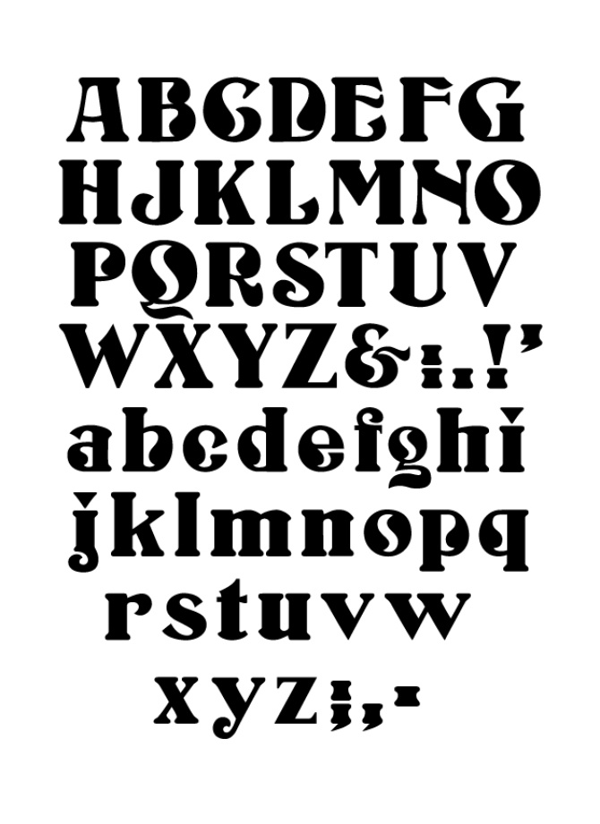
We're not sure which we like most—upper or lower case. We hope you have the same opinion and, consequently, collect both.
Production Note: we cut all fonts to order. A typical delivery is 2 to 4 months after placing an order.