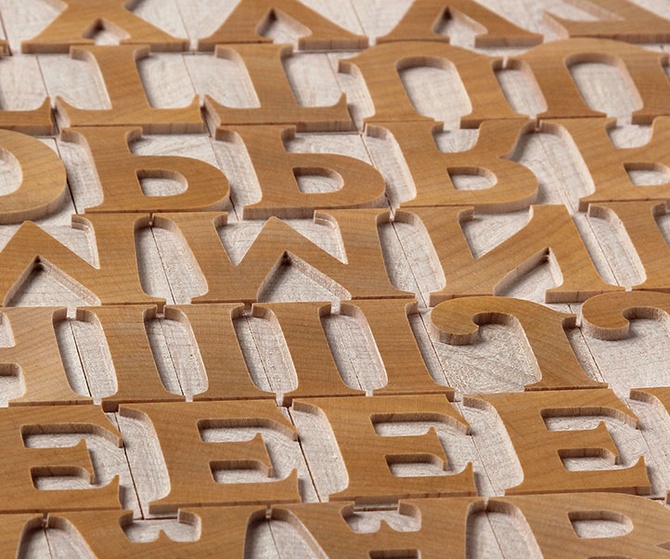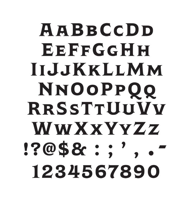

Wakerobin™ is a monotype font designed by Carl Crossgrove.
Wakerobin takes its charming swagger from the hand-painted billboard, poster and signage lettering of the mid-19th century. These showy styles did everything they could to stand out from the background cacophony of advertising, with signwriters using sharp and high contrast serif letters, squared block shapes, or art nouveau forms to grab the attention of passersby.
As well as its adaptability, Wakerobin is bursting with vintage flavour, making it hard to ignore. Its distinctive, spiky serifs would be right at home on food and drinks packaging, as well as shop windows, adverts, and any other place that calls for some typographic showmanship. It performs particularly well in busy environments, or anywhere with a lot of visual noise - just as its historic predecessors did.
Note: to acquire the small caps choose the lowercase in the menu.