Being in the business of manufacturing wood type, one must always be on the lookout for a font that would be cool in wood. When Bill and Geri bought the assets of American Wood Type in the fall of 2009, they bought the rights to many classics, Shadow, Gill Sans, to name only two. Early on they decided that part of Virgin Wood Type’s mission should be to make fonts in wood that had never existed in wood. Cleverly, these fonts are called “Extra Virgin.” Get it? An early example of this was the collaboration Bill had with Rich Kegler, founder of P22 Type Foundry, to take the first linoleum-cut and then digital Preissig Scrape and cut it into wood type.
While eating lunch at the annual Hamilton Wood Type and Printing Museum’s Wayzgoose in November 2013, Geri was engaging a few participants over lunch about her desire to offer a new font in wood that had never existed before, and “Buffalo” was suggested as being “wood typey.”
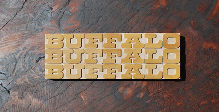
Here’s an all-too-brief history of Buffalo. It was designed by famed type designer, Ed Benguiat, while at Photo-Lettering Inc. (PLINC). In the early 2000s, master letterer at House Industries Ken Barber was inspired by five iconic PLINC typefaces and started the process of lettering them himself without benefit of the original alphabets. Fast-forward ten years or so and House had already bought the physical assets of PLINC and set about offering the alphabets to designers through its website and a smartphone app. (Wow, have times and delivery methods of fonts changed.) Dutch typographer Donald Roos digitized Buffalo for House.
OK, now we’re back to our wood type version. As fate would have it, Ken Barber also attended last fall’s Hamilton Wayzgoose. Geri asked Ken what he thought of Virgin Wood Type cutting Buffalo into wood type. Ken thought it a great idea, and he set about getting buy-in of his partners at House Industries. After getting the go-ahead, we created patterns for our hungry pantograph. This past winter/early spring, Geri, Derek, and Matt cut several hundred Buffalo characters for both House and us.
The path that Buffalo has taken is truly unique. We cannot think of another wood type font that started its life as film type. This analog to digital to wood collaboration has been fun and exciting. We couldn’t be happier with how well Buffalo fits into the pantheon of great wood type fonts.
The production of Buffalo has been slightly different from our other fonts. Although there’s little hand trimming required because of its bulbous arms and serifs, Buffalo did require more changes of the cutting bit, from a larger one to a smaller one. That being said, it has been well worth it.
We hope letterpress printers are as excited to have a new font in their arsenal as we are.
